
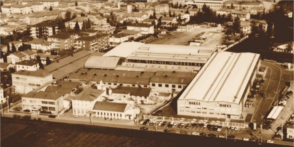
DIECI SRL: 60 years of all-Italian history
Every great company always has a lengthy history made up of people, identities, symbols, and values, the stories of which are told through its products, words, and images, which convey messages essential to the growth of the business itself. One example of this is the logo.
Let’s take a look at this simple yet fundamental element, examining the evolution of the DIECI company’s 60-year history, step-by-step.
From F.lli DIECI to DIECI S.R.L.
It was in 1962 that three brothers founded a company dedicated to the production of construction machinery and metal prefabricated parts, and named it after themselves. It was a simple yet intelligent decision, which focused on clarity and brand recognition.
At this early stage, three key elements of the evolution of the logo and the corporate identity can be identified:
- From 1962 to the late 1980s.
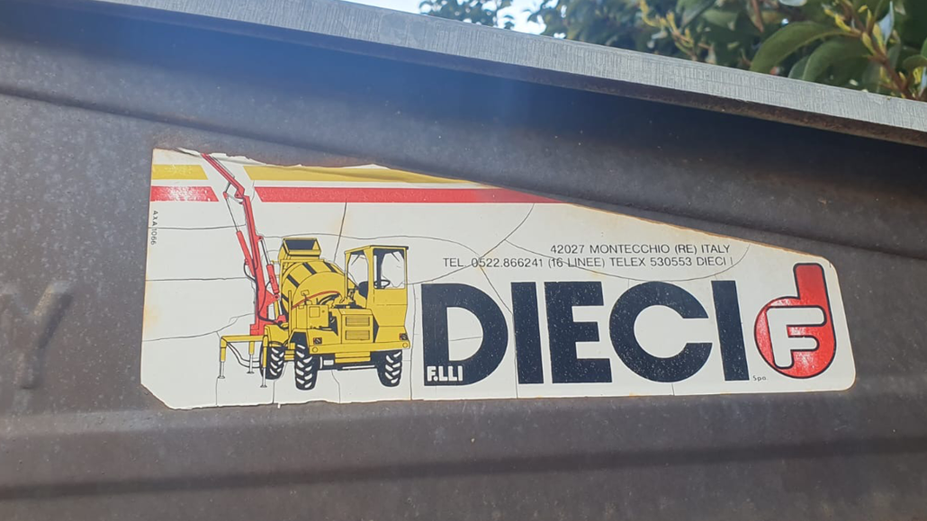
DIECI’s first logo focused on a simple and easily recognisable design consisting of the company name, F.lli DIECI s.p.A., and thanks to its historic sponsorship of Cesena football for the 1981-1986 football season, it became widely recognised throughout the Emilia-Romagna region, and even beyond; - During that same period, various graphical manifestations of the logo were applied to the machines, in an initial attempt to shift the focus away from the fratelli (“brothers”) concept and toward the DIECI brand;
- In 1997 following the company’s acquisition and the establishment of the new company DIECI SRL, the name was officially changed from F.lli DIECI to DIECI SRL.
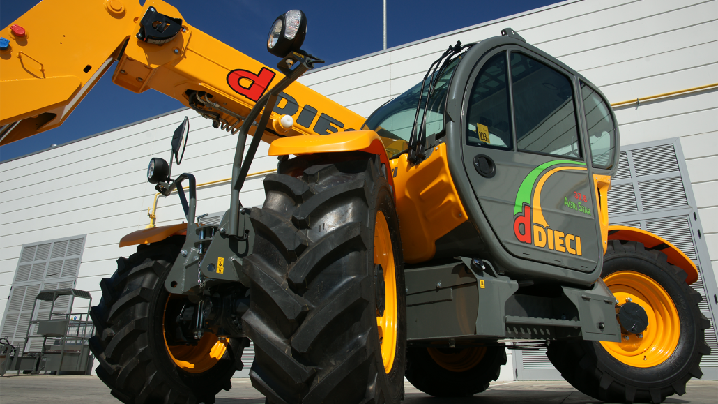
From 1997 onwards, the company began to focus on a new corporate image, keeping the name “DIECI”, which by then had become well known throughout the territory, and accompanying it with the payoff macchine edili ed agricole (“construction and agricultural machinery”), thus shifting the focus from the brand to the product.
In addition to the revision and simplification of the logo, with the red colour being maintained as a reflection of the previous version, the corporate identity was also bolstered thanks to a distinctive naming strategy for the first range of S.I.R. (Samson, Icarus and Runner) telehandlers in 1998.
The aim was to elevate certain characteristics of the construction equipment, focusing on terms from Greek mythology. In this case, the use of the name Icarus, who went so far as to touch the sun, reflects the vehicle’s considerable reach capabilities, with heights of up to 18 metres. Other telehandlers were also later given names associated with ancient mythology, such as Hercules, Zeus and Apollo.
DIECI: taking on the world with simplicity and clarity
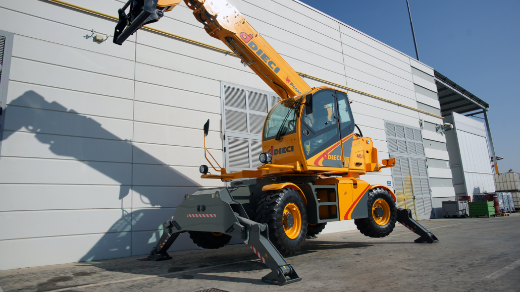
Following the acquisition, the DIECI brand grew considerably both in Italy and beyond the Alps, and it was precisely the company’s expansion into new foreign markets that led to a second restyling of the DIECI logo in 2012. In fact, the company logo was ill-suited to the new branches in France, England, and Germany, and, in particular, the Italian language payoff (“macchine edili ed agricole”) was difficult to replicate for international expansion purposes.
The transition from the 1998 logo to the 2012 one was gradual, and the key elements that united the various versions were:
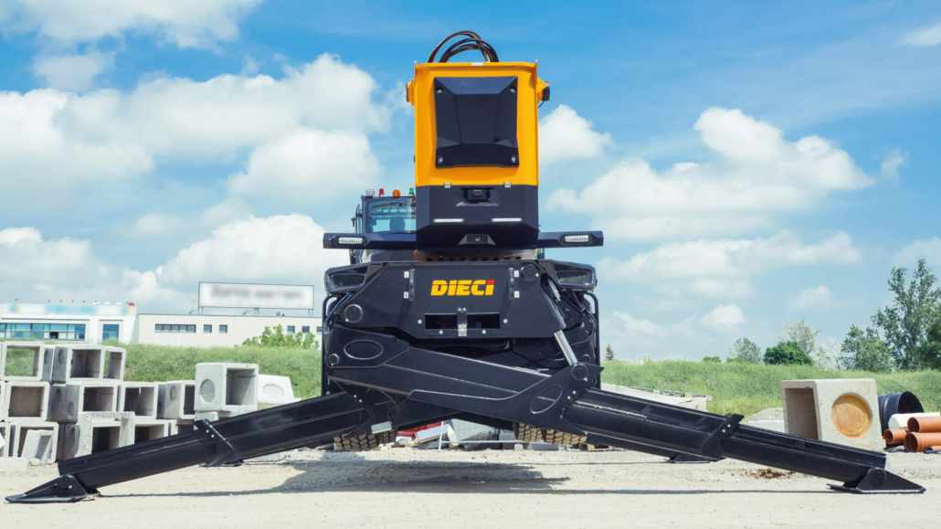
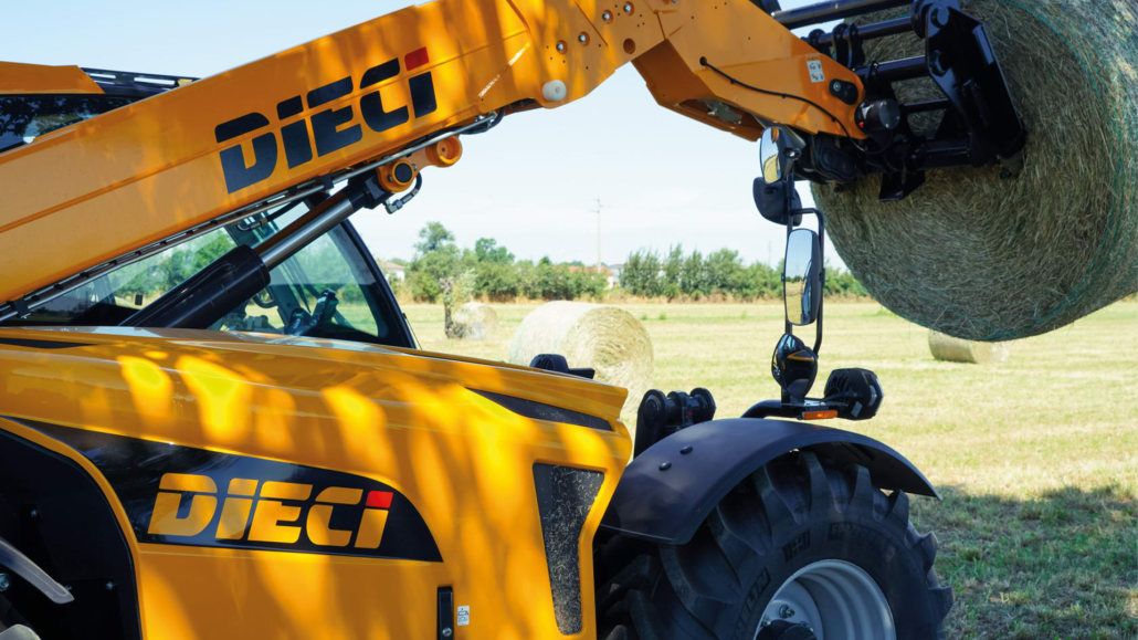
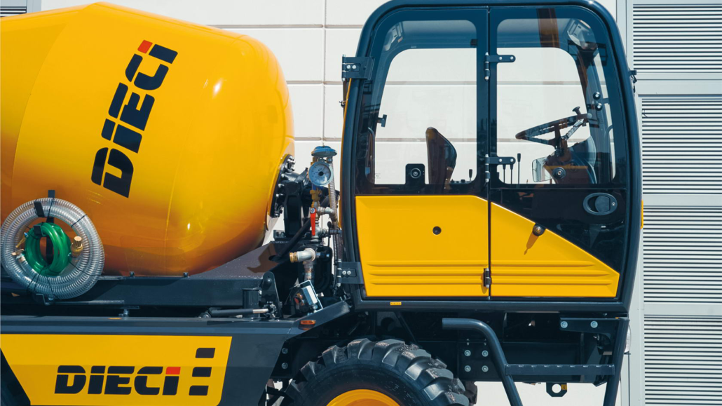
- the three corporate colours, yellow, red and black, which were present on all the machine liveries, from the telehandlers to the truck mixerss and dumpers;
- the name “DIECI” itself, which was memorable and easily recognisable, even abroad.
Thus, after nearly 50 years, the company image was definitively established as DIECI.
DIECI-e: a new chapter in the company’s history
The logo created in 2012 still represents the most distinctive element of the company’s brand identity, both in Italy and abroad.
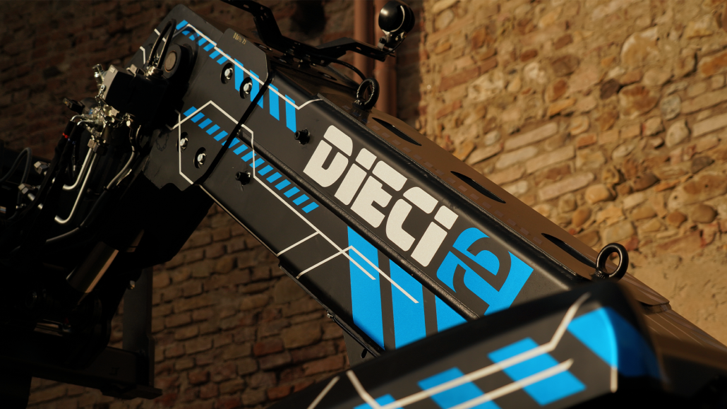
With the company’s expansion towards new, greener and more sustainable products, in 2023 the need arose to flank the main logo with a second official version, in order to represent a new product line dedicated exclusively to the world of electric vehicles.
The DIECI-e logo was thus born. Building upon a brand identity that is now well recognised among companies, customers, stakeholders, suppliers and industry leaders, the new logo:
- takes up the parent version in its entirety, focusing on the distinctive elements of the corporate identity;
- incorporates an original and distinctive “e” in light blue, designed to flank both the name of the company and those of the individual machines. A simple yet clear and distinctive symbol that reinforces the company’s commitment and focuses on the uniqueness of the electrical functions.
DIECI has thus marked the birth of its new electric range, inserting a “semicolon” within the history of an all-Italian success story: one of a clear and simple brand, that’s true to itself, and that represents all the values underlying an incredible history that spans over 60 years.